UX Audit for Velociti Mobile - Profile Screen
- Client
- AgroCenta Inc.
- Role
- UX/UI Designer
- Team size
- 3 members
- Duration
- Mar 2023 - Mar 2024
Just recently, I had to update my LinkedIn profile to add a project. Simple task, right? Grab some screenshots, write a quick description and move on, at least that’s always been the drill. But something happened while I was digging through those screens.
Mind you, this project is barely over 2 years old and as I scrolled through the screens, I came across questionable decisions, moments where I clearly prioritised speed over clarity. At first, it felt uncomfortable but later I realised that was growth sitting right there in a Figma file staring me in the face. Within a couple of years, I’ve learned enough to dissect my own work and actually see the gaps in 4k.
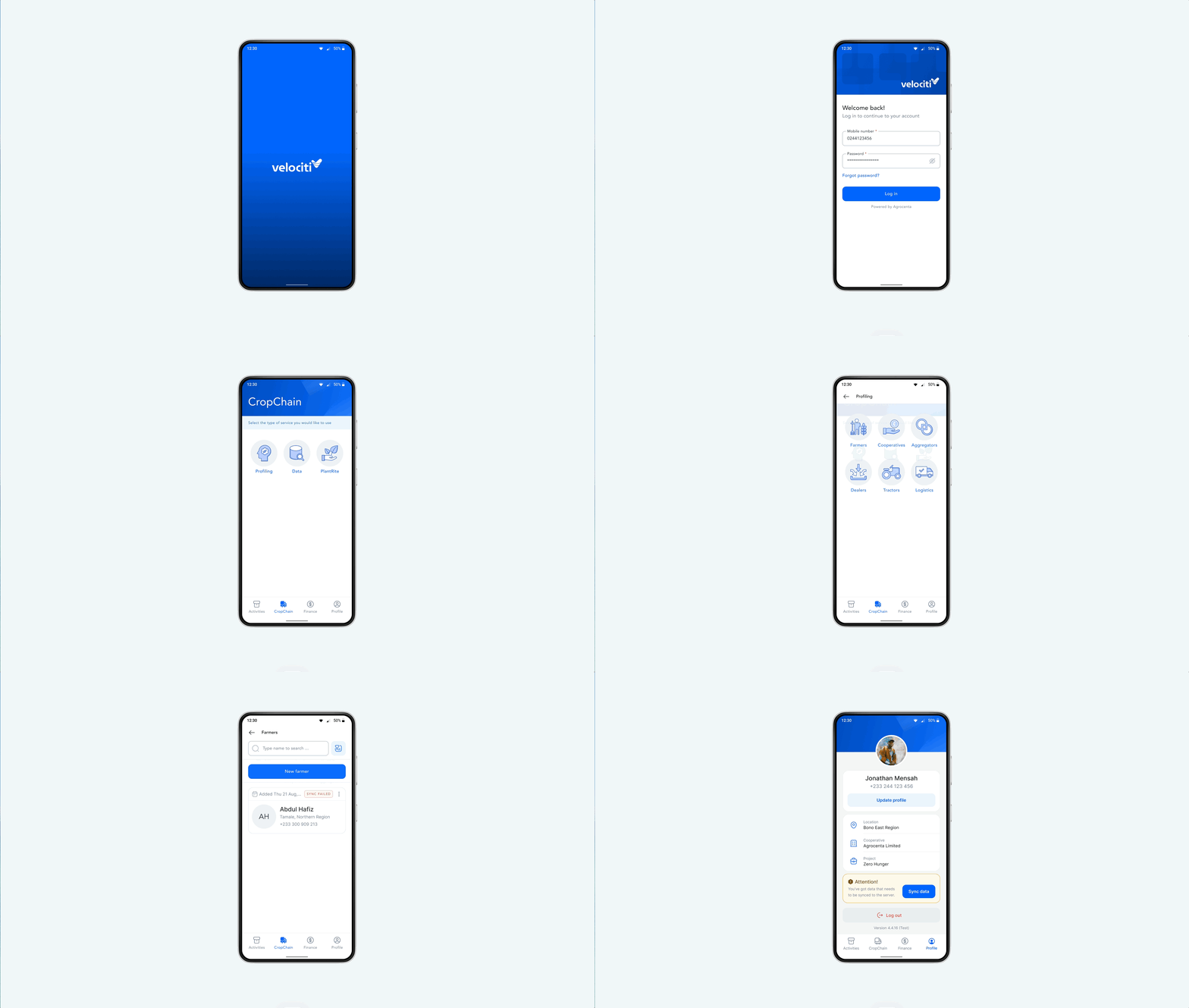
Velociti Mobile
Velociti (by Agrocenta ) is a mobile app built for data collection in agricultural settings. Agents use it to gather farmer details, financial records and farm activities that feed into larger systems. The critical requirement? It needed to work offline. Agents would be out in rural areas with spotty internet or no internet at all, collecting data all day. Once connected, the app would automatically sync everything to the server. But if sync failed, they needed a manual override to force the upload so none of that data would be lost. The sync feature wasn’t a nice-to-have, It was the entire point.
Constraints
This audit was conducted on an already shipped mobile product with a focus on improving clarity and usability without altering the underlying system. The app is designed for field agents working in rural and low-connectivity environments, often on low-to-mid range Android devices.
Given the app’s offline-first architecture, data sync is a critical and high-risk interaction, sync failures are expected and data loss must be avoided. The scope of this exercise was intentionally limited to UI and interaction improvements on the profile screen with no changes to backend logic, data models or navigation structure. All decisions were guided by heuristic evaluation, existing product patterns and a fresh-eyes review rather than new user research.
Problem 1: Unclear Data
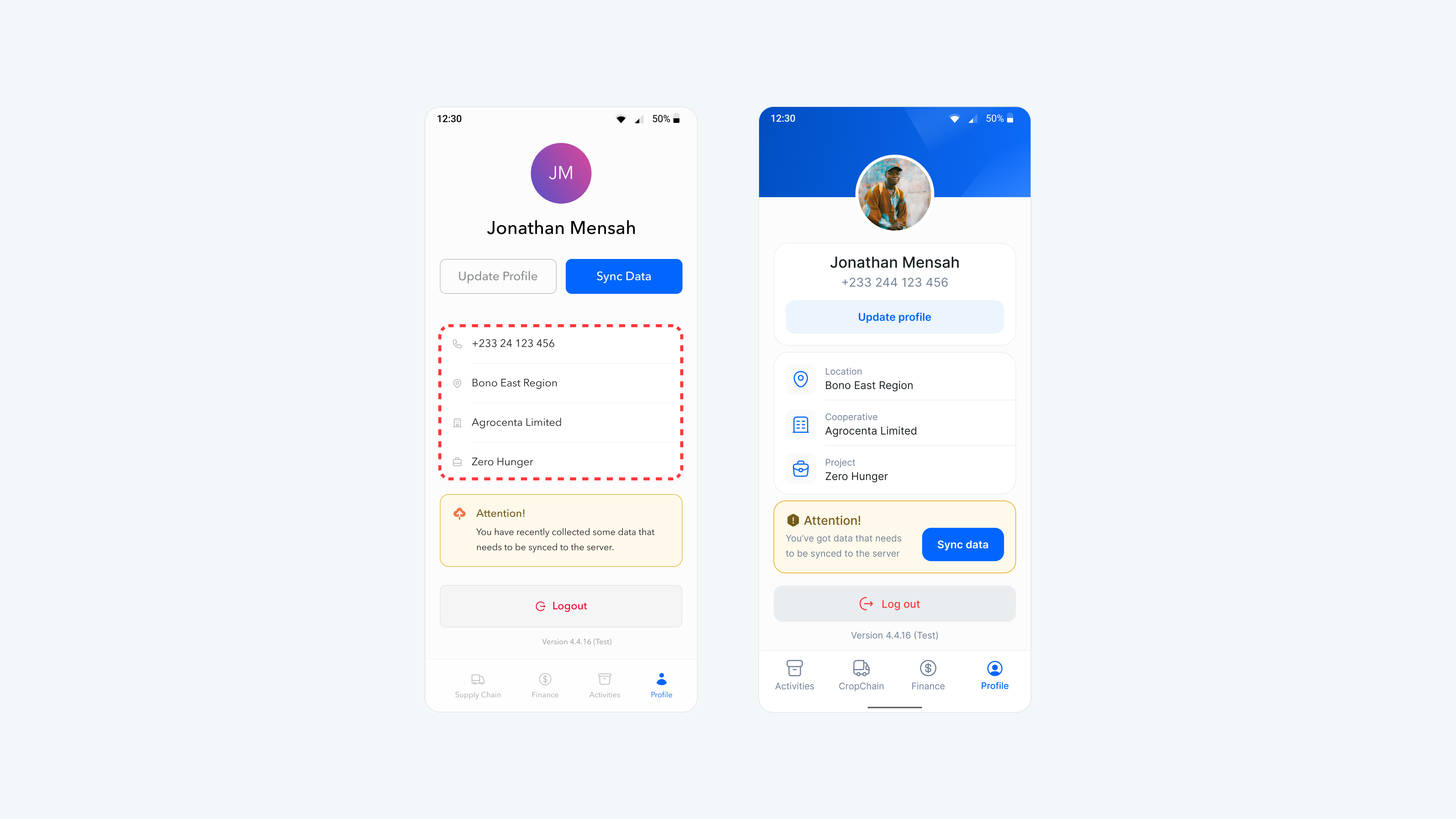
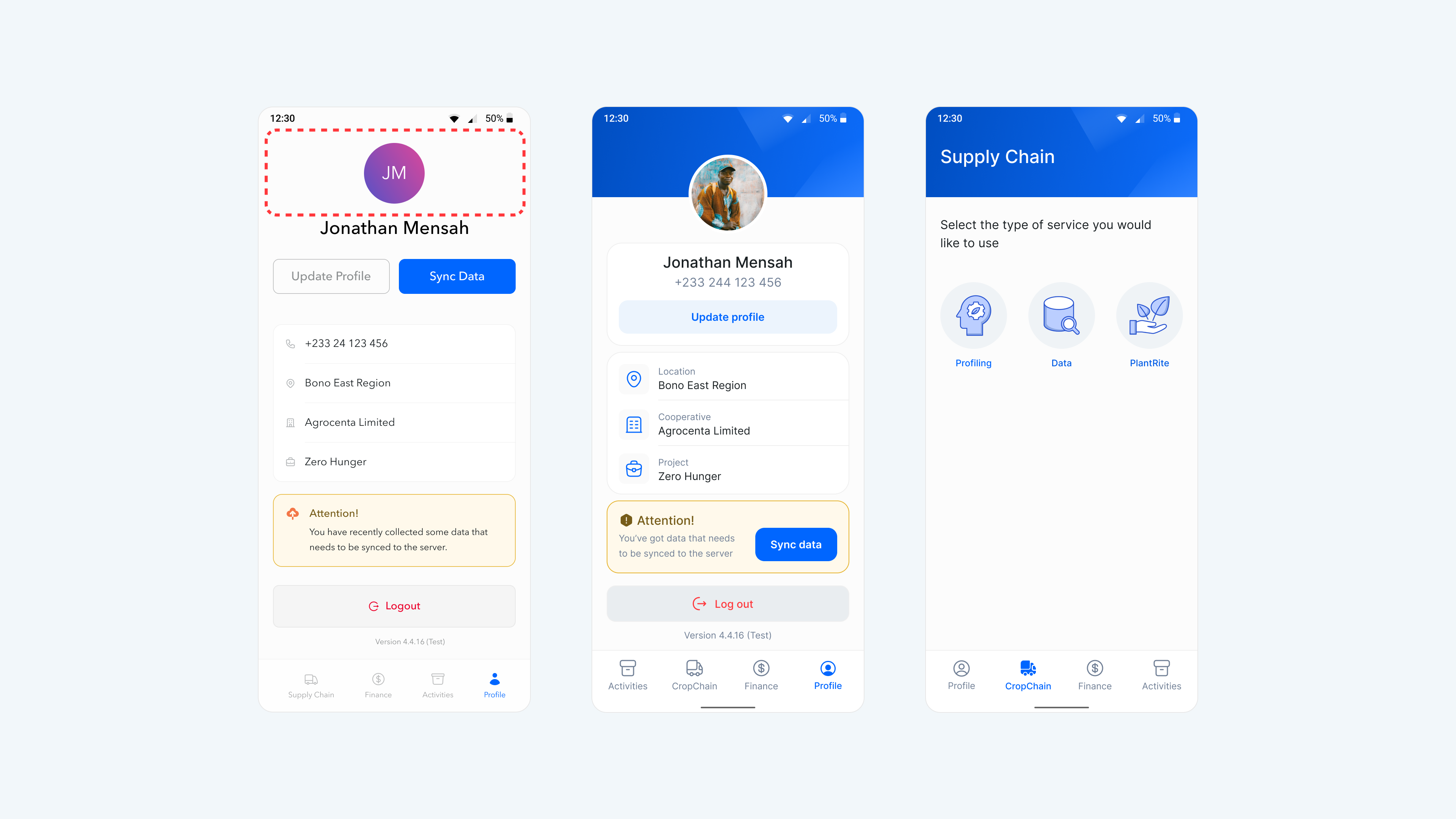
“Bono East Region.” “Agrocenta Limited.” “Zero Hunger.” These were the first to catch my attention. I quickly asked: what are these and what do they mean? There were icons next to each item, which provided a bit of a clue. The thing about icons, they suggest meaning but they don’t confirm it. I was able to make sense of “Bono East Region” because I’m Ghanaian but then I followed up with another question: what if this was presented to a foreigner (an investor or a curious cat), would they make sense of it at first glance? Then another follow-up question: what if Agrocenta didn’t have “Limited” appended to it, would it pass the clarity test? At this point, I wasn’t assuming to fit into the user’s shoes, I was knee-deep into it.
Turns out, those fields were: Location, Cooperative (like a group) and Project. But you’d only know that if you were already familiar with the app either a user, engineer or a designer. Even in my case, I designed it but, I got lost after a couple of years being away from it.
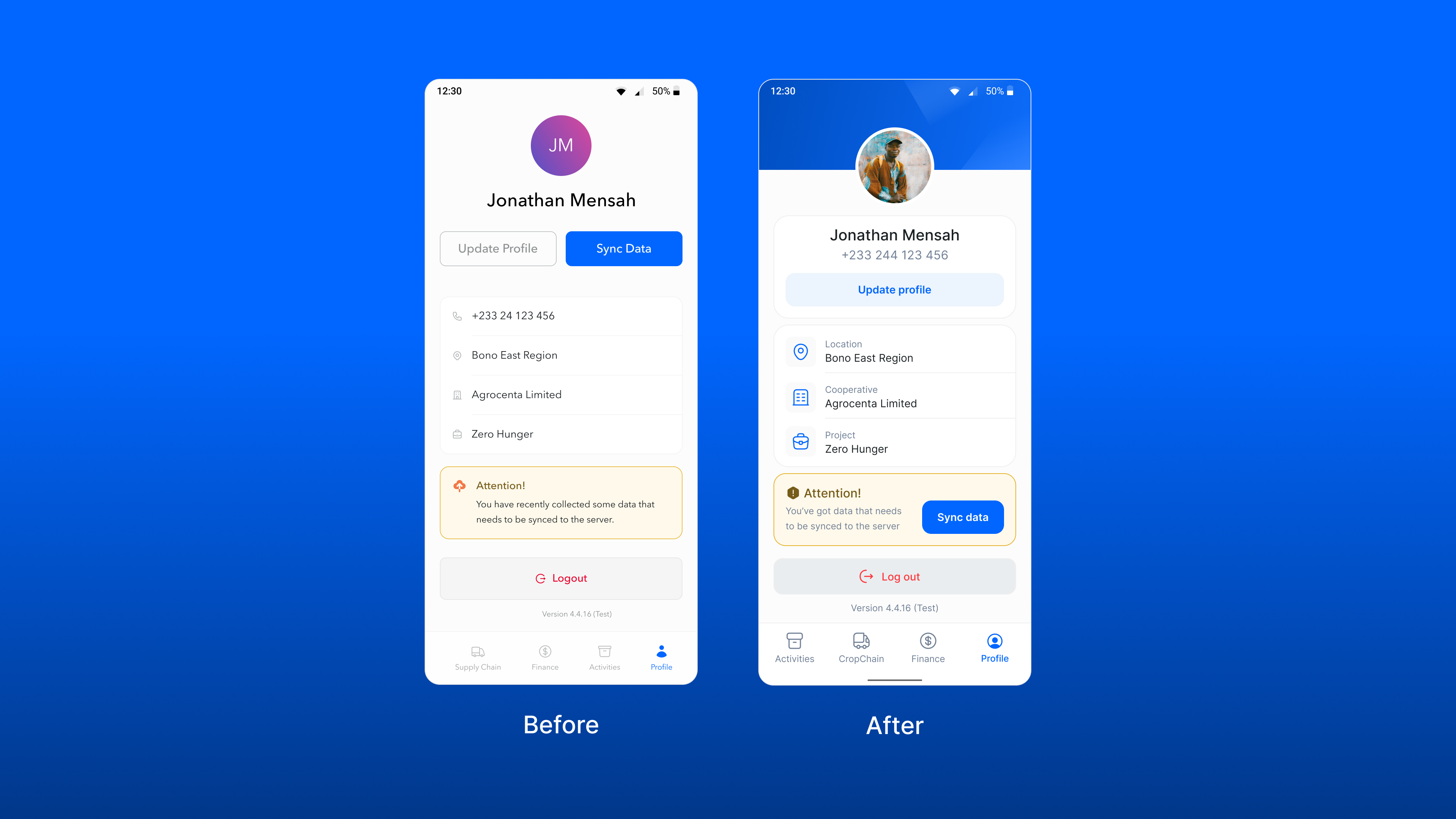
How did I fix it? I introduced labels for every data point. Simple text that says exactly what each value represents. When I come back in another 2 years or when a new user opens the app, they won’t have to guess. Basic fix, but it never crossed my mind back then.
Problem 2: Poor Grouping
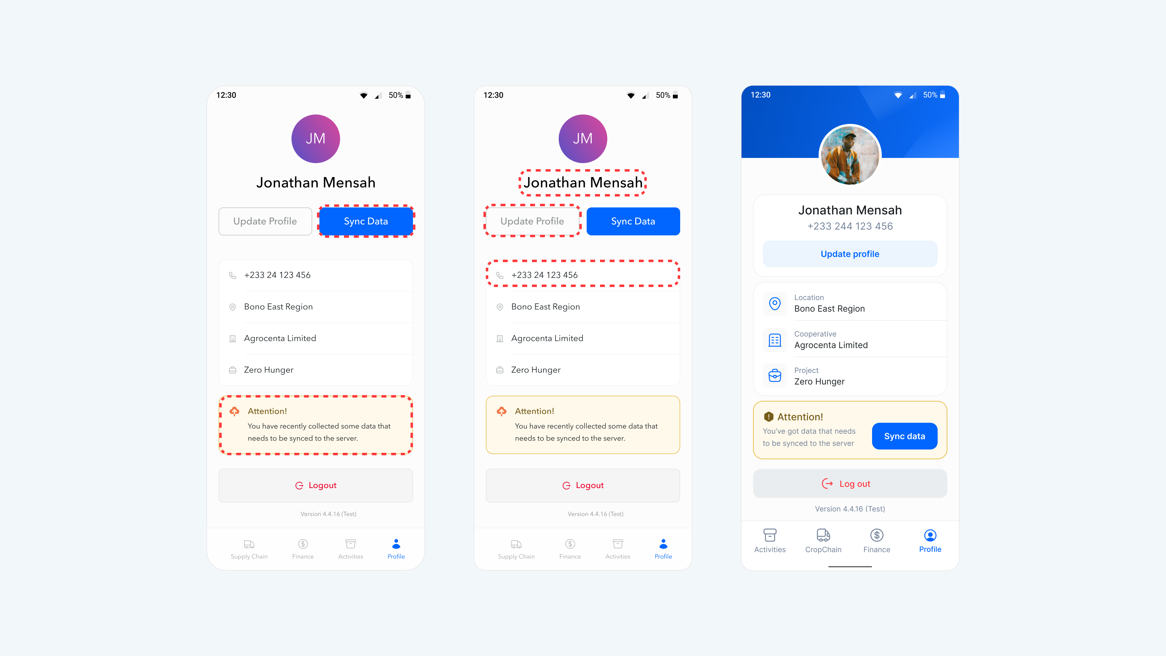
Here’s where things got worse. The sync status message sat at the bottom of the screen, miles away from the “Sync Data” button which was hanging out at the top next to “Update Profile.” This violated two Gestalt principles and the Fitts’s Law respectively: proximity and common region .
Fitts’ law states that the amount of time required for a person to move a pointer (e.g., mouse cursor) to a target area is a function of the distance to the target divided by the size of the target. Thus, the longer the distance and the smaller the target’s size, the longer it takes.
The sync status and its action button were visually disconnected. Users had to scan the entire screen to connect the information with the action. Meanwhile, “Update Profile” and “Sync Data” sat side by side in the same container, suggesting they were related functions when they weren’t. One controlled personal details, the other controlled data integrity. Completely different purposes grouped together.
The result was clear: cognitive friction. Users seeing the sync status at the bottom of the screen would have to hunt for the “Sync Data” button at the top or they’d see two buttons together and assume they served similar purposes.
How did I fix this? I moved the sync button below to live right next to the sync status message. Now the information and action share the same visual space, proximity and common region working together. The mental connection happens instantly. Plus, it puts the sync button in a thumb-friendly zone for frequent use.
To factor in critical edge cases such as: what happens when all data is synced or when data fails to sync?. To answer this, we invite progressive disclosure to the table. The sync button would be made available for only when a user needs to manually sync data. Example: When data collected from the field hasn’t been synced yet among others.
The “Update Profile” button stayed where it was, now properly separated in its own region at the top of the screen. Another change I made was moving the phone number close to the user’s name, related data again. Sounds familiar? Common region at play.
Problem 3: Inconsistency
Most main screens in the app had a blue gradient background around the page title area. The profile screen? It had none. Just a flat, neutral space. This wasn’t really a deal breaker, though just kƐchƐ “aesthetics.”
The final fix? I introduced the same blue gradient. Minor change, but it brought the page in line with the rest of the app and signaled to users they’re moving through a unified experience.
Learnings and Reflections
I designed this app with full context but users don’t have that luxury. Even I didn’t have it two years later. Design for clarity first, labels aren’t redundant when they eliminate guesswork.
When an agent is out in the field with failing internet and critical data, hunting for the sync button isn’t just frustrating, it’s risky. Visual relationships should map to functional relationships.
It’s uncomfortable to critique your own work but that discomfort is where learning lives. Two years from now, I’ll probably find new gaps and that’s exactly how it should be.
If you’ve gone back to an old project and discovered your own blind spots, I’d love to hear about it and oh! if you spotted anything I missed here, let me know.